
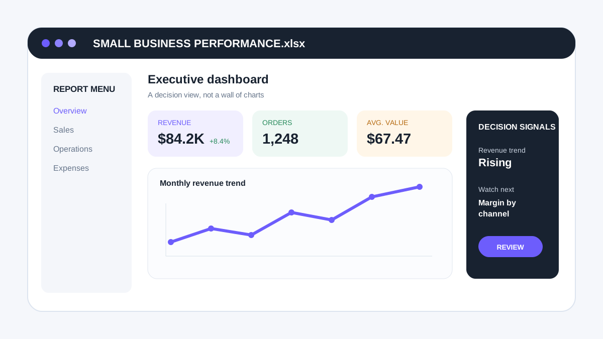
An Excel dashboard can turn rows of business data into a compact view of the numbers that matter most. The goal is not to fill a worksheet with charts. A useful dashboard helps someone answer recurring business questions faster: What changed? Where is performance off target? Which area needs attention?
For a small business, Excel is often a practical dashboard platform because teams may already use spreadsheets for sales, expenses, operations, inventory or reporting. The challenge is organizing that data so the dashboard stays understandable and maintainable.
What is an Excel dashboard?
An Excel dashboard is a reporting view that summarizes selected metrics, trends and comparisons from one or more data sources. It may use tables, PivotTables, charts, formulas, slicers or Power Query depending on the complexity of the workflow.
Professional Excel dashboard services can help structure an existing reporting process, but a good dashboard still depends on accurate source data, clearly defined metrics and a consistent update method.
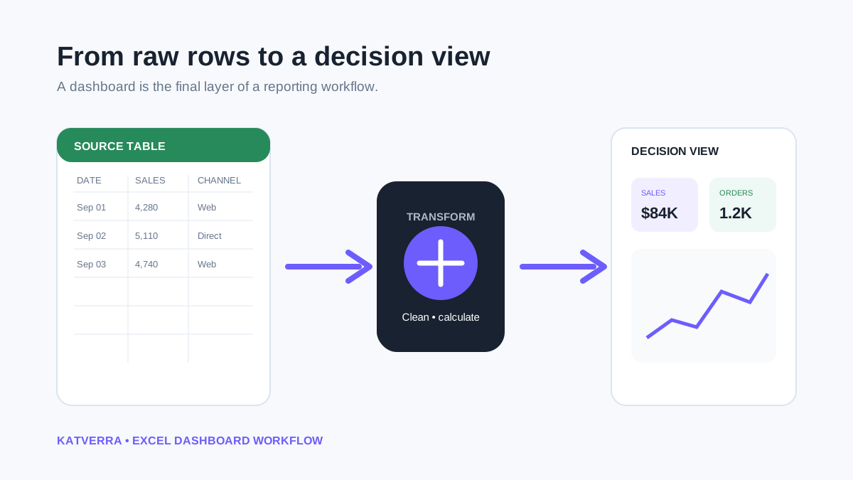
Start with the business questions
Before building charts, list the questions the report should answer. A sales dashboard might need monthly revenue, lead conversion, average order value and performance by channel. An operations dashboard may focus on workload, turnaround time, backlog or completion rates.
This step prevents a common dashboard problem: displaying every available number simply because the data exists.
Prepare a clean source table
Dashboards become fragile when the source data contains merged cells, inconsistent dates, mixed formats or manually inserted totals. A structured source table should use consistent column names and one record per row whenever possible.
Keep raw or imported data separate from the final presentation layer. That makes troubleshooting easier and reduces the chance that someone accidentally changes a formula while updating the source.
Choose KPIs that support a decision
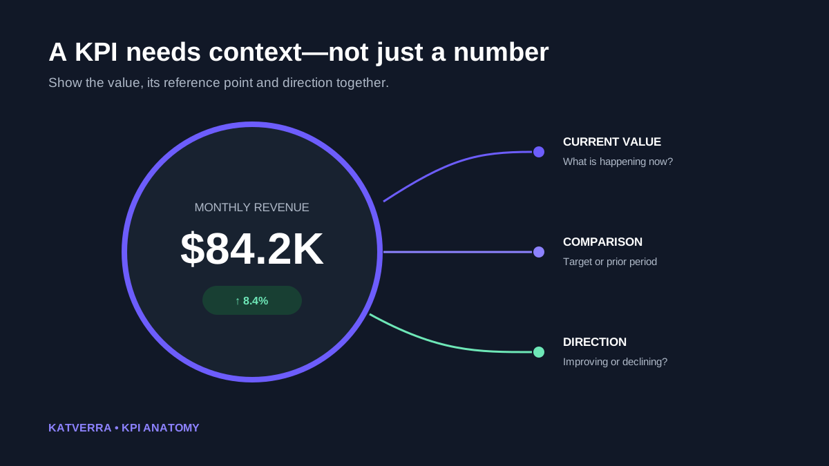
A key performance indicator should have a reason to be on the dashboard. Useful metrics often show a current value, comparison, target or trend. If a number does not help the viewer understand performance or decide what to investigate, it may belong in a detailed report instead.
Use the right Excel tools for the job
Excel Tables
Tables make ranges easier to expand and reference as new records are added. They also provide a cleaner foundation for formulas, PivotTables and reporting workflows.
PivotTables and PivotCharts
PivotTables are useful when users need to summarize data by categories such as month, salesperson, product or location. PivotCharts can visualize those summaries without rebuilding calculations manually.
Formulas
Functions such as SUMIFS, COUNTIFS, XLOOKUP and date calculations can support dashboard logic. Formula complexity should stay proportionate to the reporting need; a clever formula that nobody can maintain can become an operational risk.
Power Query
Power Query can be helpful when data must be imported, cleaned or combined repeatedly. It can reduce repetitive copy-and-paste work, although the refresh process should still be documented for the people who will maintain the file.
Slicers and filters
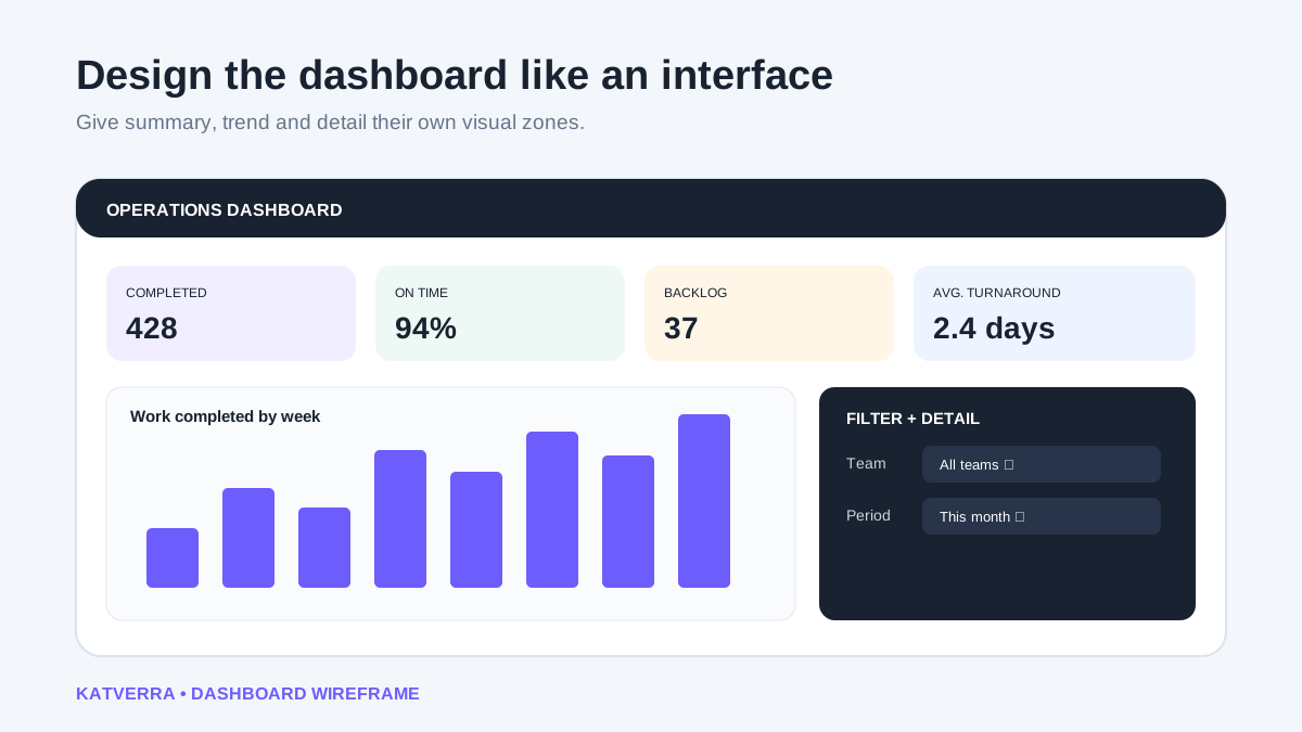
Interactive controls can let a user focus on a period, category or team without creating separate versions of the same dashboard. Keep the number of controls manageable so the interface remains clear.
Design the dashboard for scanning
Place the most important information where it can be seen quickly. Group related metrics, use consistent number formats and avoid using too many chart types. A dashboard should not require the viewer to decode the design before understanding the data.
Whitespace is useful. It separates information into logical groups and makes exceptions easier to notice.
Dashboard vs spreadsheet report
A spreadsheet report may contain detailed rows, calculations and supporting tabs. A dashboard is usually the summarized decision layer. The two can work together: detailed data supports investigation while the dashboard provides the quick overview.
If a team needs recurring analysis beyond Excel, KatVerra's broader data analysis and reporting support can cover reporting workflows as well as dashboard production.
What can be delegated to an Excel dashboard specialist?
Once the business defines its data and reporting goals, dashboard work can include source cleanup, workbook structure, formulas, PivotTables, charts, KPI cards, filters, Power Query steps, formatting and update instructions.
The business should still confirm metric definitions and the accuracy of source information. A dashboard can present the numbers clearly, but it cannot correct an unclear business definition automatically.
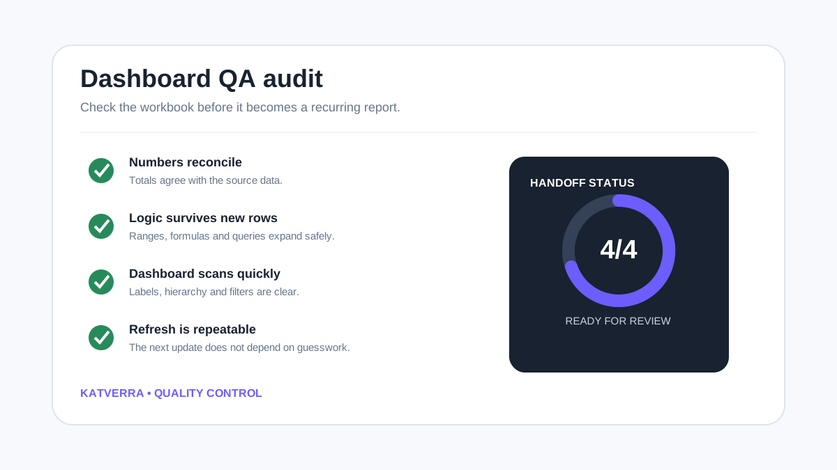
Excel dashboard review checklist
- Does every KPI answer a useful business question?
- Are source dates, categories and number formats consistent?
- Do totals reconcile with the source data?
- Are formulas and ranges designed to handle new records?
- Are charts labeled clearly and free of unnecessary decoration?
- Can the dashboard be understood without opening every supporting tab?
- Do filters and slicers behave as expected?
- Is the refresh or update process documented?
- Has the workbook been tested with realistic data?
When Excel dashboard services make sense
Outside support can be useful when reporting takes too much manual time, when management repeatedly asks for the same numbers, when a workbook has become difficult to maintain, or when a business wants a clearer reporting view without moving immediately to a larger BI platform.
The commercial keyword excel dashboard services is handled by KatVerra's dedicated Excel dashboard service page. This guide supports that page with informational content rather than replacing its commercial role.
Turn recurring spreadsheet reporting into a clearer dashboard
If your data already exists in Excel or can be exported into a spreadsheet, KatVerra can help organize it into a practical reporting view. Review our Excel dashboard services for support with dashboard structure, formulas, charts and maintainable reporting workflows.